
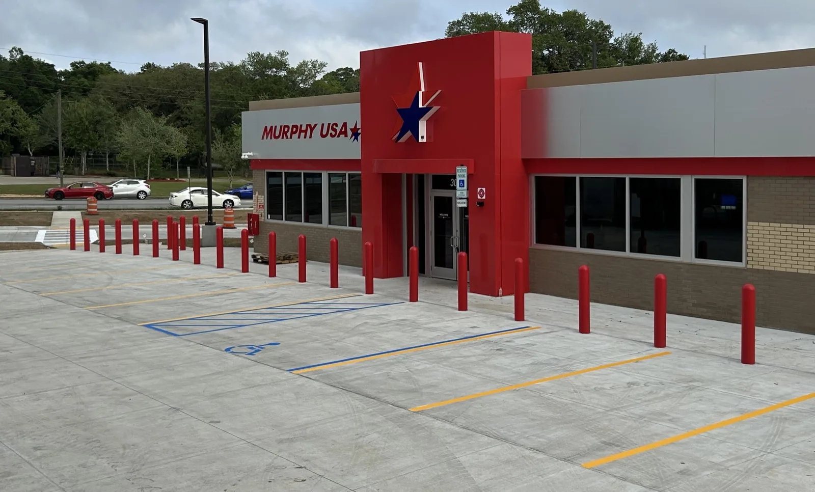
ADA signage is a legal requirement for commercial properties, and getting it wrong invites federal penalties, private lawsuits, and stalled projects. Proper signage also makes a property usable for the many Americans living with a disability. This guide covers the essentials of ADA-compliant signage: design standards, placement rules, and the mistakes that most often trigger a complaint.
Key takeaways:
- Regulations: ADA signage is required for permanent rooms, parking lots, and wayfinding. Signs must meet tactile, Braille, and visual standards.
- Enforcement: Violations can bring federal civil penalties and private lawsuits, on top of the cost of retrofitting after the fact.
- Design Standards: Use raised, sans-serif characters and Grade 2 Braille. Ensure high contrast and matte finishes.
- Placement: Tactile characters on room signs sit 48 to 60 inches above the finished floor, measured to the character baseline (ADA 703.4.1).
- Parking Signs: Accessible spaces require the International Symbol of Accessibility (ISA) and specific height and clearance standards.
Regular audits, along with striping and signage work done to spec, are what keep a property compliant between inspections.
ADA Signage Regulations Explained
The 2010 ADA Standards for Accessible Design outline the rules for signage compliance in commercial spaces and public areas across the U.S. These regulations apply to a wide range of locations, including retail stores, office buildings, hospitals, schools, and parking lots.
Signs are divided into four main categories: Identification signs (for permanent rooms like restrooms or offices), Directional signs (used for wayfinding), Informational signs (providing general details about a facility), and Regulatory signs (displaying rules or warnings). Among these, the strictest requirements apply to identification signs for permanent rooms, which must feature Grade 2 Braille and raised tactile characters.
Knowing what is required, and what is exempt, saves you from costly errors. For example, temporary signs posted for seven days or less are exempt from the signage scoping requirements under ADA 216.1, and so are company names and logos. On the other hand, permanent room identification signs must follow specific guidelines: they go alongside the door on the latch side, with the tactile baseline placed 48 to 60 inches above the floor. Characters must be raised at least 1/32 inch (0.8 millimeters) and use uppercase, sans-serif fonts like Arial or Helvetica. Decorative, italic, or script fonts should not be used for tactile elements.
Parking lot signage has its own set of rules. Signs for accessible spaces must display the International Symbol of Accessibility (ISA) and, under ADA 502.6, sit at least 60 inches above the ground measured to the bottom of the sign, so they stay visible when a vehicle is parked in the stall.
Legal Requirements for Commercial Properties
The ADA classifies retail stores, office buildings, healthcare facilities, and schools as "places of public accommodation," meaning they must comply with these regulations. Accessible signage plays a crucial role in helping people with disabilities navigate these spaces safely and independently.
The stakes for non-compliance are real. Federal civil penalties apply to violations, and a business can also face a private lawsuit brought by someone who encountered the barrier. Legal fees mount quickly, and that is money spent defending a problem instead of correcting it.
Serial litigation is a growing concern for high-traffic properties such as retail centers and hotels, where issues like an incorrect mounting height or missing Braille are easy for a plaintiff to document. A single complaint can lead to a broader audit of an entire property portfolio.
Non-compliance carries quieter costs, too. Incorrect signage can delay permits, stall a Certificate of Occupancy, and force expensive last-minute fixes right when a project is trying to open.
Even older buildings are not exempt, since modifications are required to ensure accessibility. Property owners and tenants also need to understand who is responsible for what: landlords typically handle building-wide signage such as exits and restrooms, while tenants are responsible for signage within their leased spaces, such as office names or directional signs.
Common Misconceptions About ADA Signage
Misunderstandings about ADA signage lead to costly errors. One common mistake is using the "dynamic" or forward-leaning wheelchair icon in parking areas. The 2010 Standards specify one symbol, the International Symbol of Accessibility shown in Figure 703.7.2.1, and the Manual on Uniform Traffic Control Devices uses that same symbol on traffic signs. A substitute is only defensible as "equivalent facilitation," and the burden of proving equivalence falls on the property. Sticking with the traditional ISA avoids that argument entirely.
Another misconception is that all signs must include tactile characters and Braille. In reality, only permanent room identification signs require these features. Other signs, like overhead directional signs or temporary event signage, are exempt from tactile requirements but must still meet basic visual readability standards. For instance, visual-only signs can use mixed-case text for better legibility, while tactile characters must remain entirely uppercase.
Mounting standards are another area prone to errors. ADA 703.4.2 requires an 18 inch by 18 inch clear floor space centered on the tactile characters, falling beyond the arc of any door swing between the closed position and 45 degrees open. These are measured dimensions, not eyeballed ones, and a sign that is close enough by eye still fails a tape measure.
The finish of your signs also matters. ADA-compliant signs must have a matte, eggshell, or satin finish to reduce glare, which can make them harder to read for visually impaired users. Glossy finishes, however attractive, violate federal standards. On contrast, the 2010 Standards set no percentage at all. Section 703.5.1 asks for a non-glare finish and either light characters on a dark background or dark characters on a light background, so the test is whether the two clearly read apart, not whether some number is hit.
Types of Required ADA-Compliant Signs
Different types of signs come with specific compliance rules. Recognizing what you need helps you avoid legal pitfalls. These categories lay the groundwork for understanding design, placement, and compliance in more detail.
Room Identification Signs
Room identification signs mark permanent spaces like restrooms, offices, conference rooms, storage areas, and utility closets. These signs have the most stringent requirements, since they help people with visual impairments navigate independently.
Each sign must include raised tactile characters (elevated at least 1/32 inch above the surface, per ADA 703.2.1) and Grade 2 Braille featuring domed or rounded dots. The characters should always be in uppercase, using simple sans-serif fonts like Arial, Helvetica, or Verdana. Avoid italics, script, or decorative fonts.
The rules differ for permanent and temporary signage. Signs for permanent rooms require full tactile and Braille compliance, while temporary signs posted for seven days or less need only meet visual accessibility standards.
Accessible Parking Space Signs
Accessible parking signs do two jobs: they help people find the designated spaces, and they give you the standing to enforce the stall when someone parks in it who should not.
Each accessible parking space must display the International Symbol of Accessibility (ISA), and van-accessible spaces must include a "van accessible" designation on the sign. Under ADA 502.6, these signs sit at least 60 inches above the ground, measured to the bottom of the sign, so they remain visible even when vehicles are parked. ADA 208.2.4 adds the ratio: for every six accessible spaces, or fraction of six, at least one must be van-accessible.
Van-accessible spaces need a wider footprint than a standard stall. In Florida, that means a 12-foot stall paired with a 5-foot van access aisle, plus a minimum vertical clearance of 98 inches (ADA 502.5) along the route in, so a lift-equipped van can actually enter, park, and unload.
Wayfinding and Directional Signs
Wayfinding and directional signs guide people to important accessible features such as elevators, entrances, restrooms, and emergency exits. These signs are typically visual-only and do not require Braille or tactile elements unless they identify a permanent room.
They must still comply with visual accessibility standards. That includes clear light-on-dark or dark-on-light contrast, non-glare finishes like matte or satin, and sans-serif fonts. Unlike tactile signs, visual-only directional signs can use mixed case to improve readability at a distance. Character height scales with mounting height and viewing distance: per Table 703.5.5, a sign mounted between 70 and 120 inches high and read from less than 180 inches away needs characters at least 2 inches tall, and taller characters beyond that distance.
ADA Signage Design Standards
Getting the design right matters as much as picking the correct type of sign. ADA standards lay out detailed measurements and visual requirements so signs are accessible to everyone, including people with low vision or blindness.
Tactile and Braille Standards
Tactile characters must be raised at least 1/32 inch from the background and measure between 5/8 inch and 2 inches in height, based on the uppercase letter "I" (ADA 703.2.4). ADA 703.2.6 caps the stroke thickness of that uppercase "I" at 15 percent of the character height. Note that this is a ceiling with no floor beneath it, so a thinner stroke is not a violation. All tactile text must use uppercase sans-serif fonts like Arial, Helvetica, or Verdana. Decorative, script, or italic fonts are not allowed.
Signs must also include Grade 2 Braille, the contracted form, which is shorter than uncontracted Braille and therefore fits the sign. Braille dots need to be domed or rounded, since flat or sharp dots are not acceptable, and should be placed directly below the corresponding tactile text. Under ADA 703.3.2, leave at least 3/8 inch of space between Braille and any raised characters, borders, or decorative elements.
Visual Character Specifications
Visual characters must have a non-glare finish, such as matte, eggshell, or satin, and must contrast with their background, light on dark or dark on light. Mixed-case text is allowed, but fonts must avoid italics, script, or decorative styles.
Character proportions are crucial for readability, and ADA 703.5 puts real numbers on them:
- The width of an uppercase "O" should be between 55% and 110% of the height of an uppercase "I."
- The stroke thickness of an uppercase "I" must fall between 10% and 30% of the character height.
- The spacing between individual characters should be 10% to 35% of the character height.
- Line spacing should range from 135% to 170% of the character height.
Those proportions are specific to visual characters. Raised characters carry their own, tighter stroke limit, so a shop that sets one file for both will miss on at least one of them.
International Symbol of Accessibility (ISA)
The ISA is required to mark accessible parking spaces, entrances, restrooms, and check-out aisles. It must follow the standard ISA design. Alternative symbols can only be used if they meet "equivalent facilitation" standards by providing equal or better accessibility.
Where the ISA appears as a pictogram on a sign, ADA 703.6.1 requires a pictogram field at least 6 inches high, and no characters or Braille may sit inside that field. Any descriptive text must be placed directly below the symbol field. For permanent room identification, those descriptors must include raised characters and Braille.
Placement Guidelines for ADA-Compliant Signage
Getting the placement of ADA-compliant signage right is just as important as its design. Even a perfectly built sign fails its purpose if it is installed in the wrong place. Height, location, and clearance are what an inspector measures.
Parking Lot Signage Placement
Accessible parking signs must be mounted at least 60 inches from the ground to the bottom of the sign. This height keeps the sign visible even when a vehicle is parked in the space. Place the sign at the head of the parking stall, where it cannot be blocked, and include the International Symbol of Accessibility (ISA).
For van-accessible spaces, the "van accessible" designation goes on the sign below the ISA. These spaces must be provided at a ratio of at least one van space for every six accessible spaces, or fraction of six. Van-accessible spaces, their access aisles, and the vehicular route serving them also require a vertical clearance of at least 98 inches. Check for obstructions, including landscaping that grows into the sightline over a season.
Proper parking lot signage is only one part of compliance. Interior and exterior sign placement matters just as much.
Interior and Exterior Sign Placement
For interior tactile signs, precise placement is what earns full ADA compliance. Under ADA 703.4.1, tactile characters sit between 48 and 60 inches above the finished floor, measured from the baseline of the lowest character for the low limit and the highest character for the high limit. Setting the text nearer the middle of that band leaves you margin on a floor that is not perfectly level.
Location is governed by ADA 703.4.2, and it is more specific than most people assume. At a single door, the sign goes on the wall alongside the door, on the latch side. There is no rule fixing a set distance from the door frame, so ignore any spec sheet that quotes one. What the standard does require is an 18 inch by 18 inch clear floor space, centered on the tactile characters, that falls beyond the arc of the door swing between the closed position and 45 degrees open. That clear space is what dictates how far off the frame the sign lands, and it is the reason an outward-swinging door usually pushes the sign further along the wall.
Double doors have their own rules. Where only one leaf is active, the sign goes on the inactive leaf. Where both leaves are active, it goes to the right of the right-hand door. If there is no wall space at the latch side of a single door or to the right of double doors, the sign moves to the nearest adjacent wall.
Overhead signs, such as those suspended from ceilings, must maintain a minimum vertical clearance of 80 inches from the finished floor to avoid head-strike hazards (ADA 307.4).
Working with American Curb Appeal for ADA Compliance
ADA compliance on a commercial property is rarely one trade. The sign, the paint on the stall, and the pavement underneath all have to line up, and coordinating three vendors to get there is how details fall through. American Curb Appeal has maintained commercial pavement in Tallahassee, Monticello, and across North Florida since 1998, and ADA compliance and signage is part of that work.
Signage and Pavement Together
American Curb Appeal installs the accessible parking signage that belongs with a compliant lot: the ISA, the "van accessible" plate where it is required, mounted at the height the standard calls for.
The pavement itself matters just as much. Potholes, open cracks, and faded markings all affect whether an accessible route is genuinely usable by someone in a wheelchair. A vertical separation of only 1/4 inch in a pedestrian route counts as a trip hazard under ADA, and accessible stalls and aisles are held to a 2% maximum slope. Those are the details a plaintiff photographs, and they are pavement problems, not sign problems.
Integrated Services for Complete Compliance
Pairing striping with signage installation keeps the painted stall and the post-mounted sign consistent with each other. That work includes:
- High-visibility blue and white layout for accessible stalls and access aisles
- Signage mounted at the required minimum height of 60 inches
- Concrete work for ADA ramps, landings, and sidewalk connections, so the route from the parking area to the entrance is uninterrupted
Scheduling is usually the constraint on an occupied property. Fast-cure striping paint lets a lot reopen roughly 30 minutes after the last stall is painted, which is what makes it possible to bring a lot back into compliance without closing the business for a day.
Owner Terry Thompson built the company on single-source delivery, so a property manager is not coordinating a striping crew, a concrete crew, and a sign vendor separately. Every job is quoted to its own scope, whether that is a restripe or a full accessibility upgrade.
Conclusion and Key Takeaways
ADA-compliant signage is not a recommendation, it is a legal requirement, and violations carry federal penalties along with exposure to private lawsuits. Beyond the legal side, proper signage is what lets a person with a disability use your property without asking for help.
To stay compliant, keep the essentials in mind: permanent room signs must include tactile characters and Grade 2 Braille, all signs should have non-glare finishes and clear contrast, and parking lot signs must be mounted at least 60 inches to the bottom of the sign so they stay visible.
Conduct regular audits to catch violations before someone else does. Remember also that state and local regulations can be stricter than the federal standard, so check both.
For a commercial property in Tallahassee, Monticello, or anywhere across North Florida, American Curb Appeal can handle the signage and the pavement compliance in one pass, which is usually the difference between a compliance item getting closed out and getting deferred another year.
FAQs
How do I know which signs must include Braille and raised text?
Signs that identify a permanent room or space need Braille and raised text: restrooms, exits, room names, stairwells, and similar fixed features in a place of public accommodation. Directional and wayfinding signs that do not identify a permanent space are exempt from the tactile requirement, though they still have to meet visual standards for contrast, finish, and character size. The tactile signs are what let a person with a visual impairment confirm where they are without asking.
What is the fastest way to audit my building for ADA signage issues?
The fastest way to identify ADA signage issues is a walk-through of the critical areas: restrooms, entrances, and directional signs. Look for tactile characters, Braille, high-contrast colors, non-glare surfaces, and correct mounting heights, measured to the baseline of the tactile characters. Working from an ADA checklist with a tape measure in hand is enough to find most problems and rank what to fix first.
Do state or local rules change ADA signage requirements?
Yes. State and local regulations can go beyond the federal standard, with additional rules about placement, design, or materials. Florida properties in particular should confirm the state accessibility code alongside the federal ADA standard, since the stricter of the two is the one you have to meet.
Need parking lot maintenance?
Contact us today for a free proposal on your next pavement project.
Get Your Free Proposal